Typography
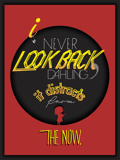
Edna Mode from The Incredible Inspired Poster Design
I have always been the biggest fan of Pixar movies, and The Incredibles is the one that turned me into one. Edna Mode was a super fantastic character in the film. I also incorporated Darling into Dahling because that's how she says it. That wasn't a typo. My approach was to create a sleek, modern and clean font, and it was the feeling Edna gave me. The colour palette portrayed her pride and ego and was based on the movie theme, like the super suits. The centre layout brought everything together and felt like the movie logo. The pin hooked over the 'I' was a perfect element to add in, as Edna is a fashion designer.
Branding
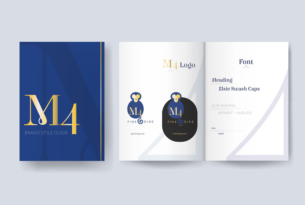
M4 Fine Dining Brand Identity
I created the logo and brand identity for this restaurant. The restaurant owner has a background story of how the brand name was decided; hence the monkey image was incorporated. I created the fine and simple look for a newly built restaurant meant to be fancy, sleek and easy to remember. The colour palette was designed to match the blue requested by the owner. Typography choices were to create modern, clean and elevated images to match the brand.
Packaging

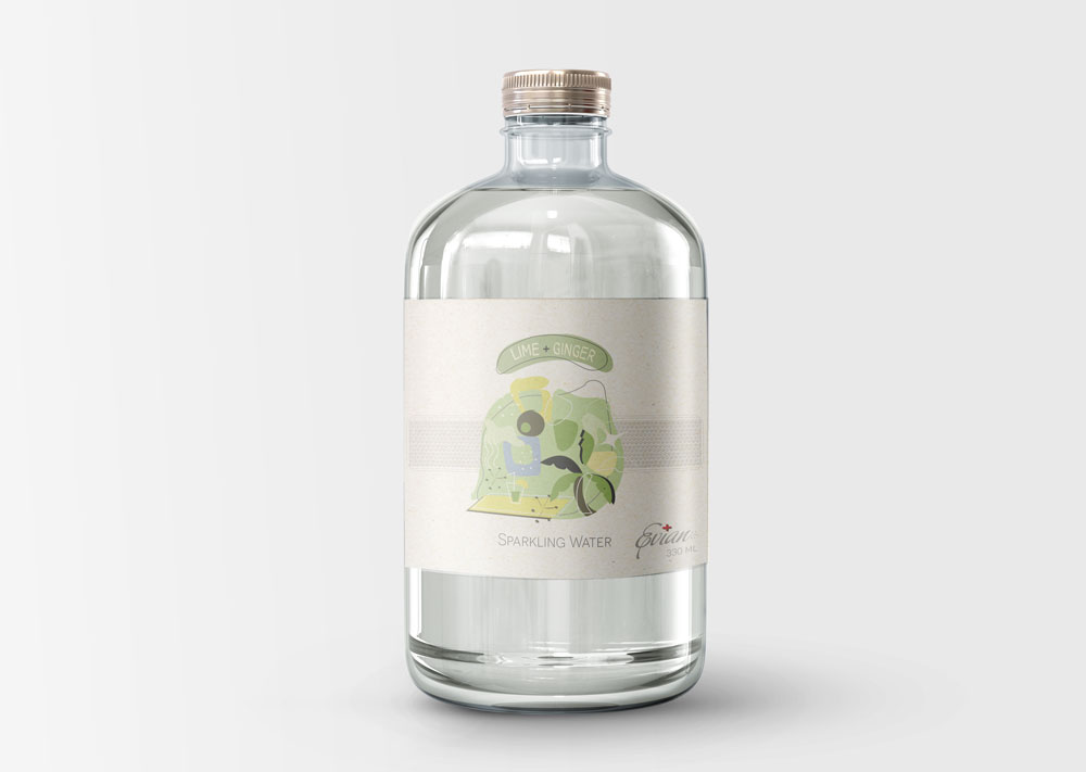
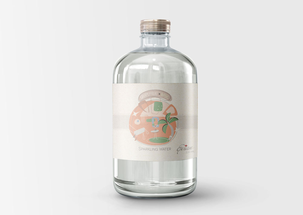
Evian Retro-Rebrand to 1950s
One of my favourite projects is to rebrand Evian with the 1950s vibe. The label was printed on recyclable material, glass for the premium branding of the drinking water and the metal lid to add a touch.
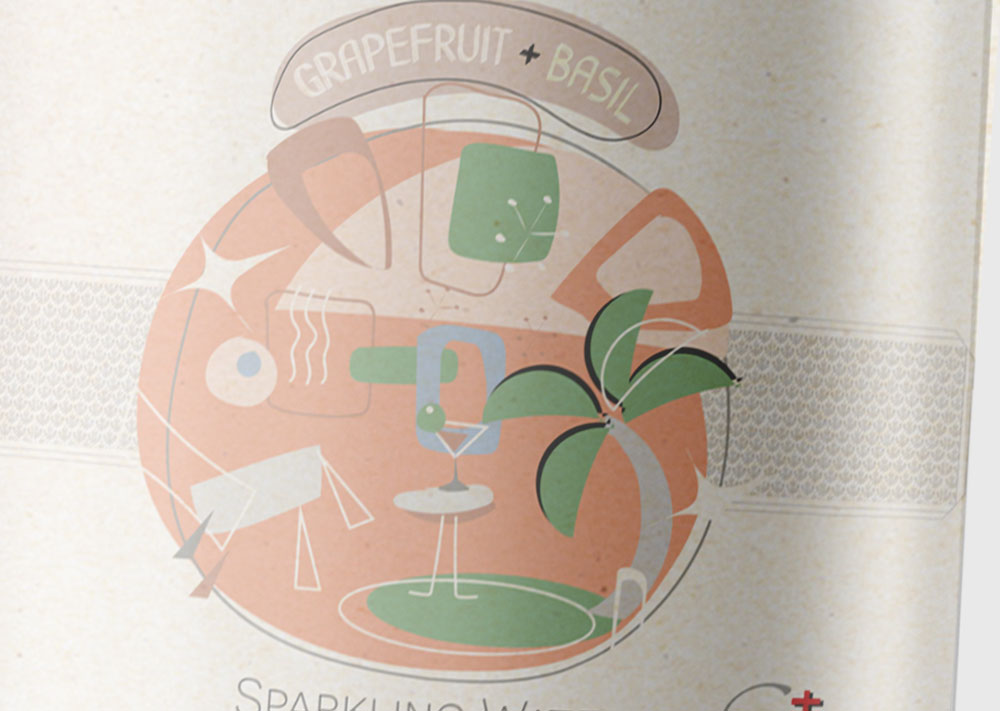
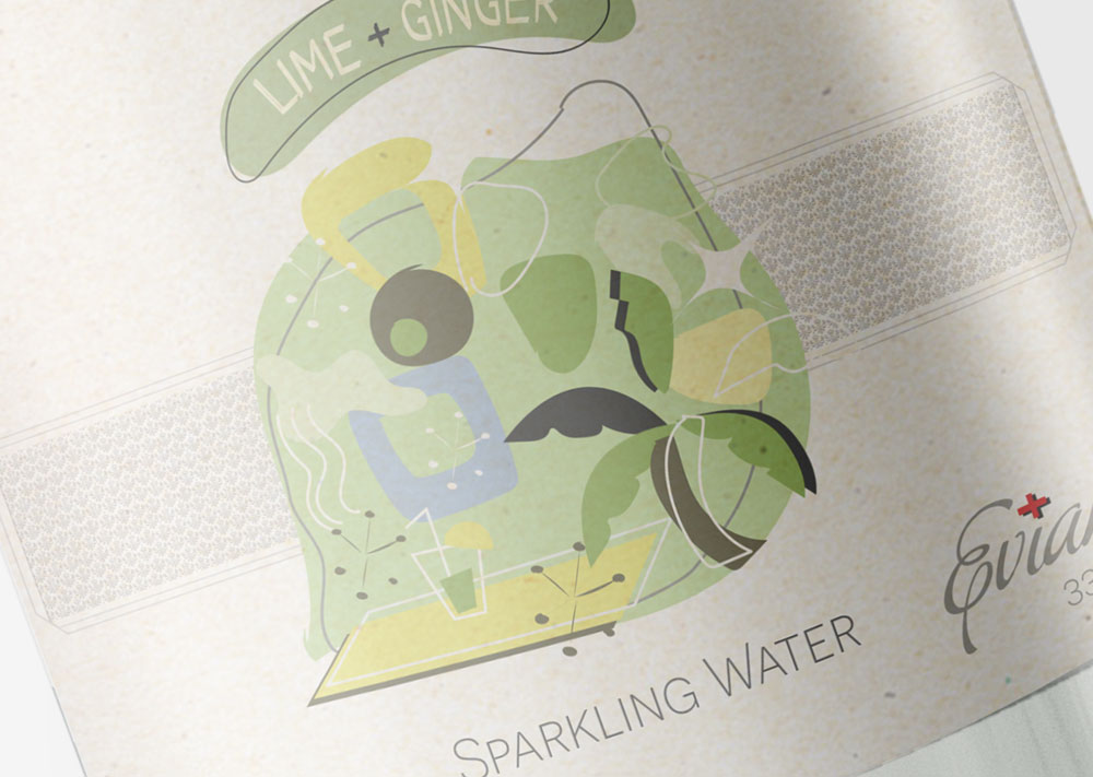
I've chosen a retro-muted colour palette to begin this project, and the illustration was made to match the theme and flavour. Every abstract image creates the vibe of drinking in every situation. Each of them is carefully curated. The condition and palette change with different flavours, and every consumer can imagine themselves living in the moment.
